Dulux Colour Forecast for 2020
The demands on our time and attention have never been greater. Our devices buzz 24/7, alerting us to the arrival of new information, fresh deadlines and more pressure. Fake news jostles with the facts, making it hard to distinguish between what's real and what isn't. We yearn to step away from our screens and have more authentic, grounded experiences. At the same time, we're increasingly environmentally conscious. In response, design trends for 2020 will reflect our desire to pause and reconnect with the essence of what matters most to us. Recycled materials, nature-inspired palettes, and furniture that blends old and new will come to the fore, signalling a more mindful approach to the curation of our living spaces.
Informed by extensive global trends research, the 2020 Dulux Colour Forecast 'Essence' is a collection that brings together gentle neutrals and muted brights drawn from the natural world – botanical, mineral and oceanic. The collection consists of four unique palettes: Comeback, Grounded, Cultivate and Indulge, plus a small, specially curated palette of four bold hues, designed to be mixed and matched with the trending palettes for an individualised look.
"These colour trends are influenced by what's happening in the world around us," says Andrea Lucena-Orr, Dulux Colour and Communications Manager. "With more focus on mental health, the wellness movement continues to gain momentum, as does an emphasis on natural materiality."
"Colours for 2020 are more restrained than in previous years. Brights are pulled back and influenced by nature. They appear in smaller doses – think feature walls and details – and are often used tonally as a backdrop for hero furniture pieces. Neutrals are soft and sophisticated, with a gently faded feel that speaks of stillness and calm. Clay, with its warm, earthy appeal, is emerging as a key neutral."
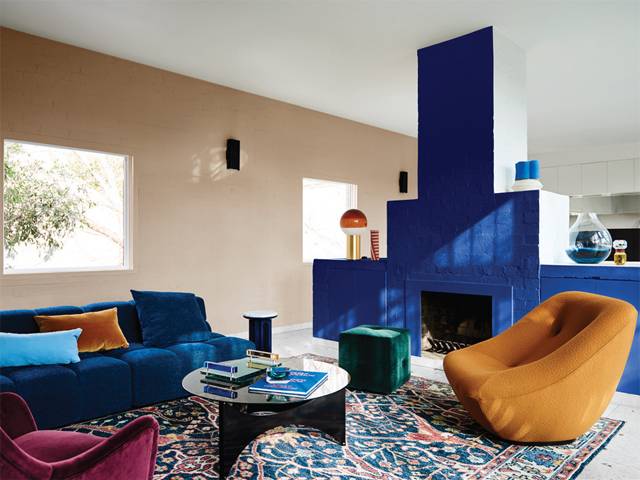
With life pulling us in different directions, we look to our home as somewhere to recharge our energy and fuel our creative thinking. Comeback is a fresh and invigorating palette consisting of rich oceanic and mineral shades of blue-green, azure and amber, highlighted with warm tones of burgundy, rust and clay. Accents of black add gravitas. "There's a lightness and fluidity to the ocean tones in this palette that speak of creativity and adventure, while the warm, earthy shades add cosiness," says Lucena-Orr. "It's the ideal backdrop to combine furniture from different eras – from mid-century through to the 80s – in elegant and refined shapes."
Where luxury was once associated with a hefty price tag, it now conveys a sense of craftsmanship, longevity and understated beauty, reflecting a shift in our values. As we seek to simplify our lives, a 'less is more approach' permeates everything we do. We are turning away from cheap, mass-produced pieces and seeking out quality designs made from honest materials. Interior spaces are pared-back and uncomplicated, with furniture in natural materials such as honeyed timbers, pale leather and linen. The Grounded palette combines gentle, livable neutrals, running from soft grey and biscuit through to muddy lavender, punctuated with warm coral. "We're seeing a more tonal palette for 2020, and Grounded is a perfect example. It has a soft, neutral feel that creates a sense of relaxation in a space, with gold and coral adding touches of luxe."
Nature is no longer an afterthought in home design. We're increasingly aware of the positive effects of nature on our mental and physical health and seek new and innovative ways to bring it inside, whether it's growing our own food or creating lush displays of indoor plants. The Cultivate palette is a serene layering of greens – from soft olive and a pistachio to verdant forest green – with accents of plum, curd and chalky blue adding an unexpected edge. "The colours and textures in Cultivate are easy to work with and have a warmth that really conveys the essence of 'home'," says Lucena-Orr. "They look beautiful paired with raw, mid-tone timbers, natural stone and transparent, coloured glass."
With jam-packed schedules leaving little room for fun, we look to create spaces that act as theatres for the soul, keeping our dreams of adventure alive. The Indulge palette is decadent and luxurious, featuring rich burgundy, eggplant, earthy brown, faded terracotta and soft coral. Styling makes a nod to the past, with nostalgic touches of 70s disco and art deco.
"This palette is not for the faint-hearted – it's dramatic and exciting and is guaranteed to add wow factor to a master bedroom, dining room or living room," says Lucena-Orr. "Pink, a key colour of the last few years, makes an appearance, but in a more neutral tone that's closer to tan, alongside a warm, dusty rose."
"Trends can be a useful roadmap when choosing colours, but it's those little touches of the unexpected that give your home personality," says Lucena-Orr. The Dulux Highlights palette consists of four fun, fashionable brights – a 70s-inspired fuchsia, primary blue, orange-red and acid yellow – that can be combined with any of the four 2020 colour palettes to create a unique look. "Use them however you like – on a wall, front door or in a nook – to really make the space your own."
There's no more effective way to bring your home up to date than with paint colours. "Once you've lived with colour, you will never want to return to a blank canvas," says Lucena-Orr. "Paint is fast, fun, and affordable. Best of all, you can easily switch things up if you want to try something new and there's nothing more satisfying than the end result."
To learn more about the Dulux Colour Forecast 2020 or to view the eMag visit: dulux.com.au
Informed by extensive global trends research, the 2020 Dulux Colour Forecast 'Essence' is a collection that brings together gentle neutrals and muted brights drawn from the natural world – botanical, mineral and oceanic. The collection consists of four unique palettes: Comeback, Grounded, Cultivate and Indulge, plus a small, specially curated palette of four bold hues, designed to be mixed and matched with the trending palettes for an individualised look.
"These colour trends are influenced by what's happening in the world around us," says Andrea Lucena-Orr, Dulux Colour and Communications Manager. "With more focus on mental health, the wellness movement continues to gain momentum, as does an emphasis on natural materiality."
"Colours for 2020 are more restrained than in previous years. Brights are pulled back and influenced by nature. They appear in smaller doses – think feature walls and details – and are often used tonally as a backdrop for hero furniture pieces. Neutrals are soft and sophisticated, with a gently faded feel that speaks of stillness and calm. Clay, with its warm, earthy appeal, is emerging as a key neutral."
With life pulling us in different directions, we look to our home as somewhere to recharge our energy and fuel our creative thinking. Comeback is a fresh and invigorating palette consisting of rich oceanic and mineral shades of blue-green, azure and amber, highlighted with warm tones of burgundy, rust and clay. Accents of black add gravitas. "There's a lightness and fluidity to the ocean tones in this palette that speak of creativity and adventure, while the warm, earthy shades add cosiness," says Lucena-Orr. "It's the ideal backdrop to combine furniture from different eras – from mid-century through to the 80s – in elegant and refined shapes."
Where luxury was once associated with a hefty price tag, it now conveys a sense of craftsmanship, longevity and understated beauty, reflecting a shift in our values. As we seek to simplify our lives, a 'less is more approach' permeates everything we do. We are turning away from cheap, mass-produced pieces and seeking out quality designs made from honest materials. Interior spaces are pared-back and uncomplicated, with furniture in natural materials such as honeyed timbers, pale leather and linen. The Grounded palette combines gentle, livable neutrals, running from soft grey and biscuit through to muddy lavender, punctuated with warm coral. "We're seeing a more tonal palette for 2020, and Grounded is a perfect example. It has a soft, neutral feel that creates a sense of relaxation in a space, with gold and coral adding touches of luxe."
Nature is no longer an afterthought in home design. We're increasingly aware of the positive effects of nature on our mental and physical health and seek new and innovative ways to bring it inside, whether it's growing our own food or creating lush displays of indoor plants. The Cultivate palette is a serene layering of greens – from soft olive and a pistachio to verdant forest green – with accents of plum, curd and chalky blue adding an unexpected edge. "The colours and textures in Cultivate are easy to work with and have a warmth that really conveys the essence of 'home'," says Lucena-Orr. "They look beautiful paired with raw, mid-tone timbers, natural stone and transparent, coloured glass."
With jam-packed schedules leaving little room for fun, we look to create spaces that act as theatres for the soul, keeping our dreams of adventure alive. The Indulge palette is decadent and luxurious, featuring rich burgundy, eggplant, earthy brown, faded terracotta and soft coral. Styling makes a nod to the past, with nostalgic touches of 70s disco and art deco.
"This palette is not for the faint-hearted – it's dramatic and exciting and is guaranteed to add wow factor to a master bedroom, dining room or living room," says Lucena-Orr. "Pink, a key colour of the last few years, makes an appearance, but in a more neutral tone that's closer to tan, alongside a warm, dusty rose."
"Trends can be a useful roadmap when choosing colours, but it's those little touches of the unexpected that give your home personality," says Lucena-Orr. The Dulux Highlights palette consists of four fun, fashionable brights – a 70s-inspired fuchsia, primary blue, orange-red and acid yellow – that can be combined with any of the four 2020 colour palettes to create a unique look. "Use them however you like – on a wall, front door or in a nook – to really make the space your own."
There's no more effective way to bring your home up to date than with paint colours. "Once you've lived with colour, you will never want to return to a blank canvas," says Lucena-Orr. "Paint is fast, fun, and affordable. Best of all, you can easily switch things up if you want to try something new and there's nothing more satisfying than the end result."
To learn more about the Dulux Colour Forecast 2020 or to view the eMag visit: dulux.com.au

MORE
FEMALE.COM.AU
CONTACT US
FOLLOW US ON
Copyright © 2001 - Female.com.au, a Trillion.com Company - All rights reserved.